
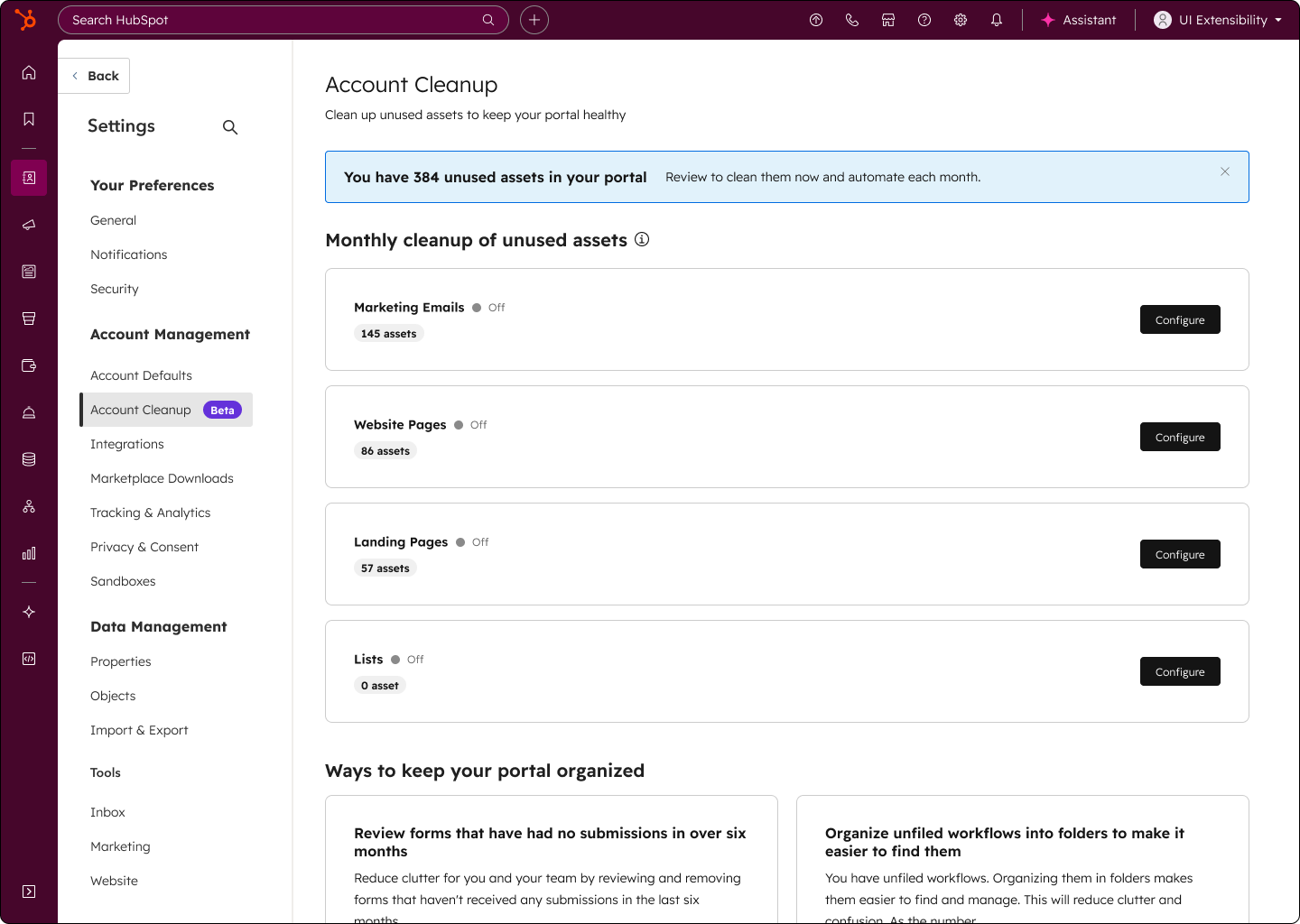
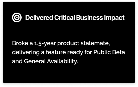
TLDR: When I joined, ‘Account Insights’ had been stuck in beta for over a year — nobody knew what problem it truly solved. By redefining its purpose as ‘Account Cleanup’ and validating it with data, we turned a stalled experiment into a trusted, high-retention feature.
My Role
Lead Product Designer (Strategy, Vision, UX/UI, Prototyping & Testing)
Timeline
6 months (April - Sep 2025)
Overview
I took the initiative to unblock a feature stalled for 1.5 years, using a new strategic vision and key user insights to iterate the design into a GA-ready solution.
When I joined, the 'Account Insights' app was stagnant. The core problem wasn't the technology, but a lack of a shared vision, which created two business problems:
1. A Stalled Roadmap: Paralyzed development and wasted resources.
2. Low User Engagement: Beta users were confused about the product's purpose.
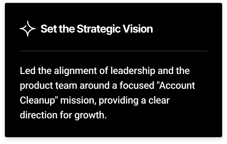
My challenge was to define the product's reason for being and create the momentum needed to ship.
The Journey: Setting the Vision and Iterating with Data
My process was focused on moving the team from uncertainty to clarity and action.
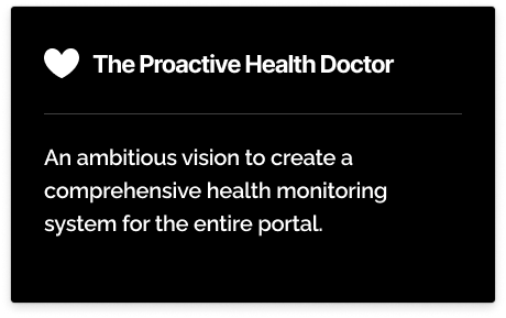
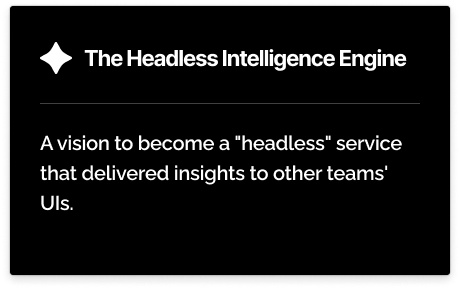
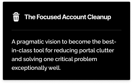
Phase 1: Defining the Strategic Visions
To break the deadlock, my first step was to synthesize our research into three distinct visions, each representing a different strategic bet for the team.
Phase 2: The Data-Driven Recommendation
To make a clear recommendation, I developed a framework to evaluate each vision against three key criteria: User Signal, Team Autonomy, and Time-to-Value. The "Focused Account Cleanup" vision was the only one backed by strong, existing user behavior. I pulled the engagement data from Amplitude, which made the decision clear.
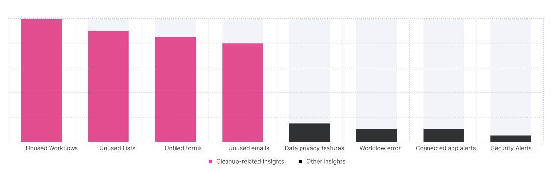
The framework below synthesized this data and other risks, making the final recommendation an easy one to align on.
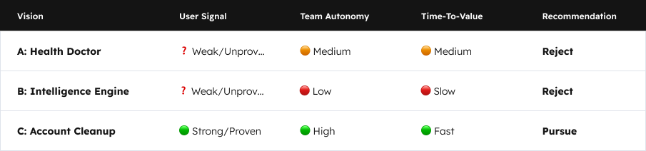
I used this data-driven rationale to pitch my recommendation, which successfully aligned leadership and the team on a clear and achievable path forward.
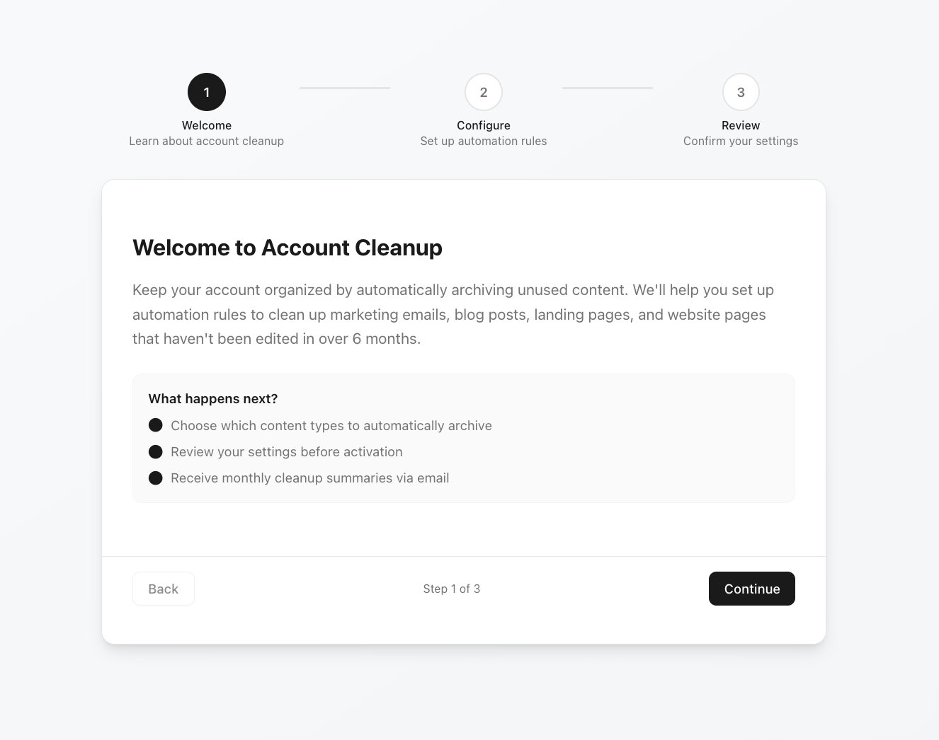
Phase 3: Building and Testing a Fast MVP to Validate Direction
With our Account Cleanup strategy in place, our next priority was to learn as quickly as possible. We made a key strategic trade-off: to build our first MVP using an existing, constrained automation component so we could move fast. By leveraging that component, we avoided building from scratch and were able to test the concept with customers in the fastest way possible.
To find the best layout for the MVP, I used v0 to quickly prototype three concepts (Guided Wizard, Notification Feed, Static Dashboard).
Guided Wizard
Pro: Best for hand-holding and building user trust.
Con: Most complex to build; high friction for a simple MVP
Notification Feed
Pro: Fastest to build.
Con: Not a typical Hubspot interaction pattern
Static Dashboard
Pro: Good "source of truth" for what's active.
Con: Poor for first-time setup and discovery.
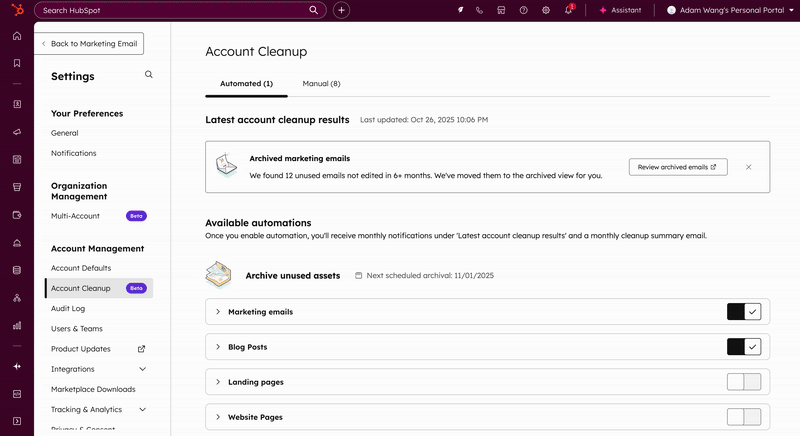
After reviewing these trade-offs, the team and leadership aligned on The Notification Feed pattern. It was, by far, the fastest to implement and would allow us to test our core hypothesis (do people even find this valuable?) with the least engineering effort. I then designed this concept in Figma, and this is the final MVP of Account Cleanup concept we launched into private beta.
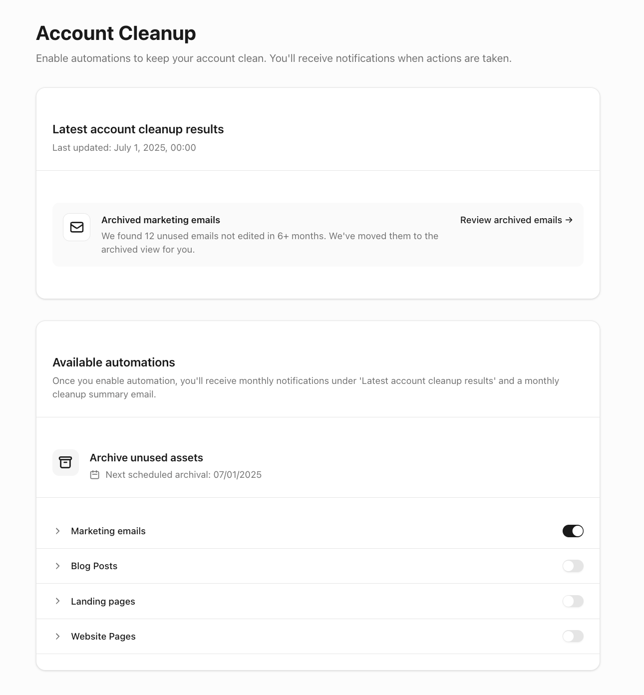
Phase 4: Finding the Activation Barrier
We then ran usability tests and analyzed the data from this private beta MVP. The results were the crucial insight that shaped the entire project.
.png)
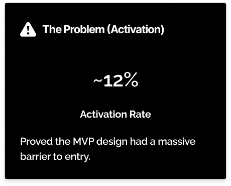
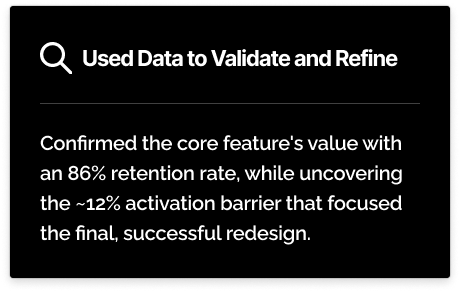
Users told us this simple list of automations with toggle was terrifying. They were afraid to turn it on, asking "What will it delete?" This was our 'aha!' moment. We had validated the concept's value but proved the MVP's design was not enough.
This gave me the critical evidence to go back to leadership and say: "The concept is a winner. To unlock its potential, we must build our own components and design a new experience that solves for user fear."
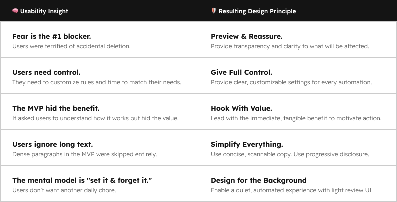
I used these insights to create our new design principles.
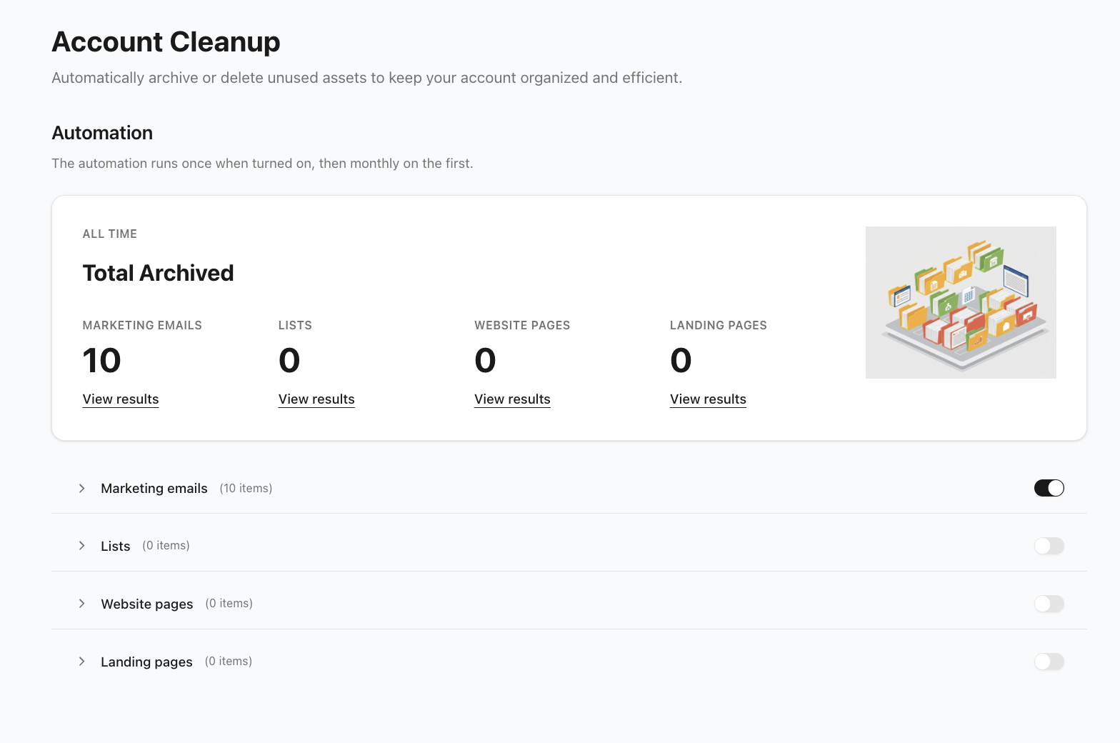
The Solution: A Redesign Built on Value and Trust (The "After")
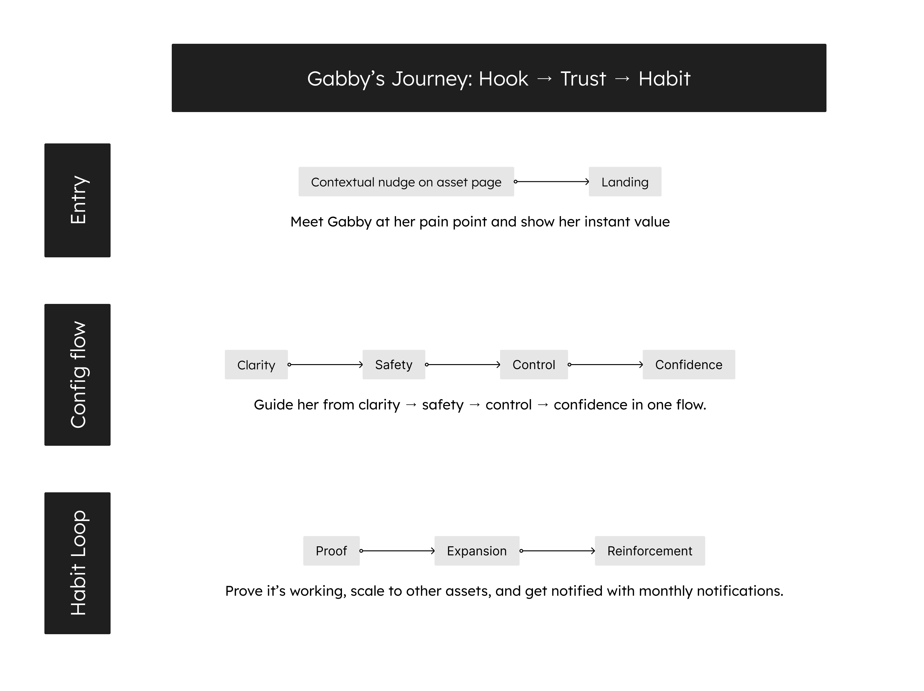
The new, GA-ready solution was designed as a two-part journey: first, to lead with value in the user's workflow, and second, to build their trust during configuration.
Part 1: The Hook (The "Lead With Value" Strategy)
My first principle, "Hook With Value," was designed to solve the 12% activation problem by finding the perfect moment in the user's journey. To do this, I collaborated with designers from three different asset teams to align on the best entry point. We designed a contextual nudge that appears right after a user manually archives an asset or visit the archived folder, asking if they'd like to automate the task.
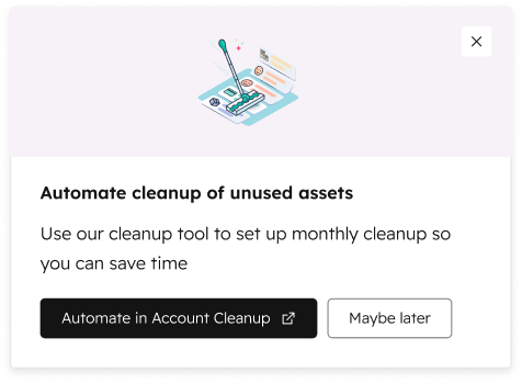
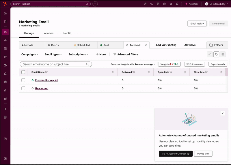
This nudge led them to our new landing page, which was designed to reinforce this value.

Part 2: The Configuration Flow (The "Trust Ladder")
Once the user clicks "Review," our job shifts from motivation to building trust. This new flow, which we were now able to build custom, was designed as a strategic ladder to systematically solve for the user's fear:

The "trust ladder" in the configure flow
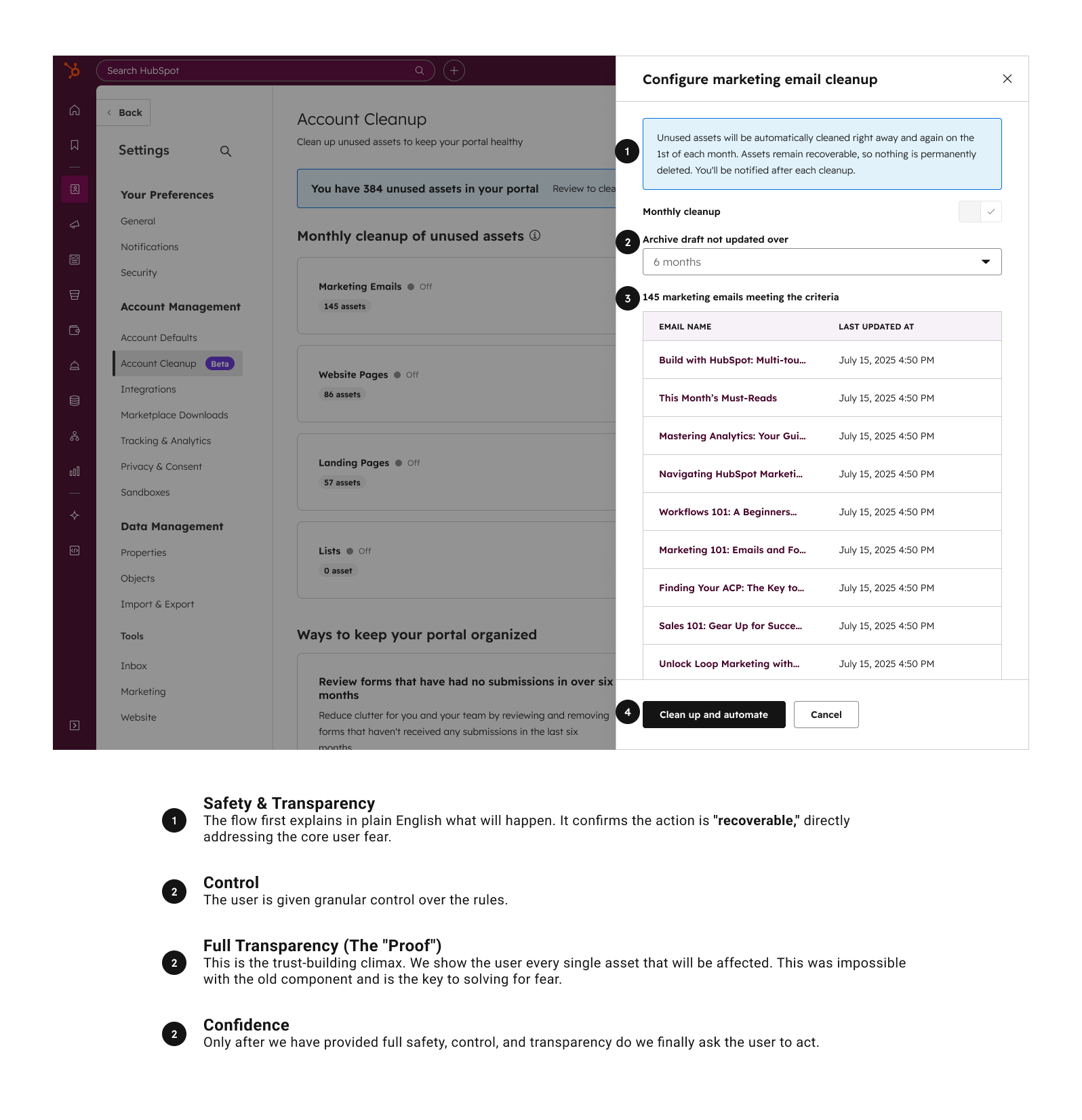
Flow Level Strategy
Reflections & What I'd Do Differently
Our decision to launch a constrained MVP was a tough trade-off, but it was the right one. It wasn't a "failure"—it was a success. It proved our core concept's value (86% retention) and perfectly isolated the problem to solve (12% activation) with real data, which is far more valuable than just an internal prototype.
My Initial Incorrect Assumption:
I initially assumed the 12% activation was a usability problem (e.g., a confusing layout). The research proved it was a much deeper emotional problem (a lack of trust). This was a crucial lesson in looking beyond the interface to solve for underlying user psychology.
Data-Driven Storytelling as Leverage:
My biggest takeaway was learning how to use data to influence the roadmap. The initial "fear" insight was qualitative. The 12% activation rate was the hard, quantitative evidence that transformed my design recommendation ("this is concerning") into a compelling business case ("this is a major blocker to adoption"). This hard data was the key that unlocked the leadership buy-in and engineering resources for the full, custom redesign.
Designing for Trust, Alignment, and Clarity:
This project taught me that unlocking adoption isn’t just about better UX — it’s about designing for trust, team alignment, and clarity.