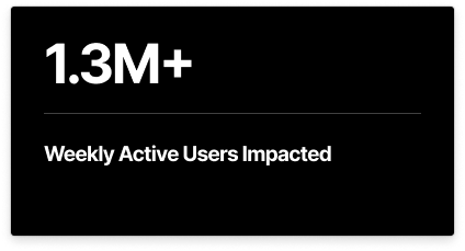
A 0-to-1 feature design that created a faster, non-disruptive search experience, now handling over 82% of all search queries for HubSpot's 1.3 million+ weekly active users.
My Role
Lead Product Designer (Strategy, Vision, UX/UI, Prototyping & Testing)
Timeline
6 Months (July 2024 - Dec 2025), Concept → GA
Outcome
Successfully launched, reducing search-to-click time by 23% and handling 82% of all search clicks.
.gif)
The new Minified Search experience became the preferred way for users to find information, validating its success in addressing the core challenges.
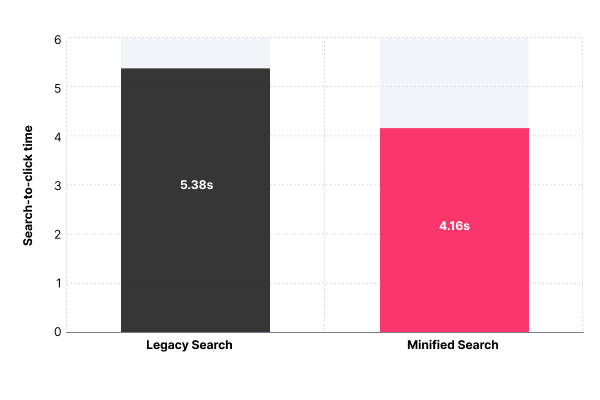
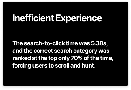
1. The median search-to-click time decreased by 1.22 seconds—from 5.38s to 4.16s—a 22.7% improvement.
2. 82.2% of all search clicks now happen within the new minified view.

The quantitative results were validated by overwhelmingly positive feedback from our users, who highlighted the efficiency gains in their daily workflows.
"LOVE IT... it feels much faster and easy, when you hover your mouse it gives you the associations. this is game changer!" - Sonny, owner of a marketing firm
"..I like the smaller screen, as it means you can still reference the information in the background..." - Natasha, marketing director of a health device company
“I heard at Inbound Hubspot emphasizes on easy and fast, this is the best representation I’ve seen.”- Chris, ops manager of a retail company
HubSpot is a leading CRM platform that helps over 200,000+ companies manage their marketing, sales, and customer service operations. For the platform's 1.3 million+ weekly active users, who are often deep in complex workflows, search is a critical feature that needs to be fast, efficient, and non-disruptive.
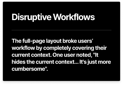
However, the existing full-page search experience was creating significant friction.


.gif)
Minified Search is a dropdown experience anchored to the global search bar. It’s designed for speed and context, helping users find information without leaving their workflow.
Key features:
1. Instant access to recent items – The dropdown opens with the user’s five most recent searches, making common lookups nearly instantaneous.
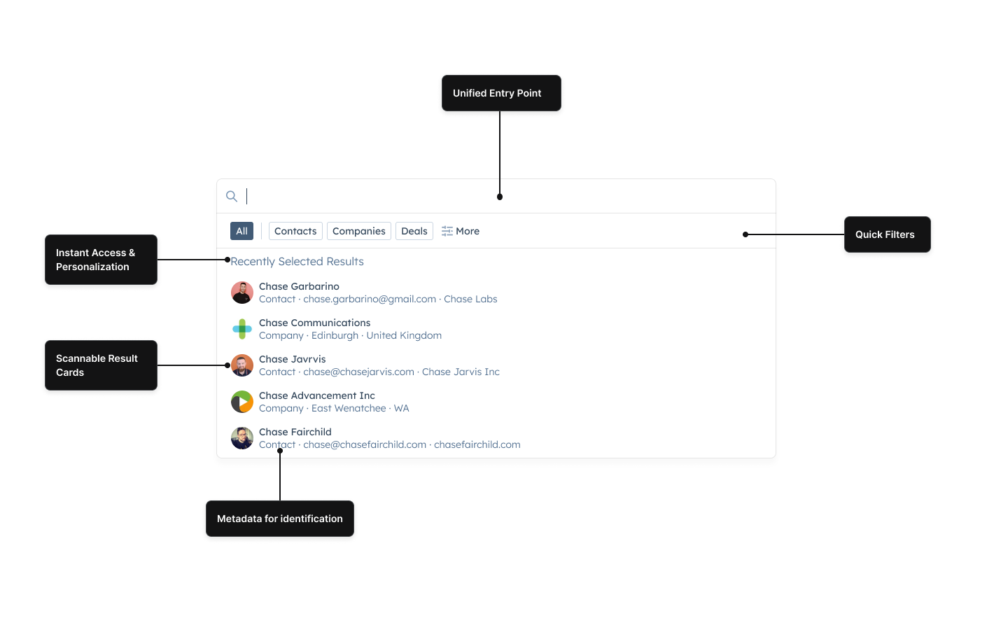
2. Rich previews on hover – Users see critical details (e.g., name, company, job title) before clicking, reducing unnecessary navigation.

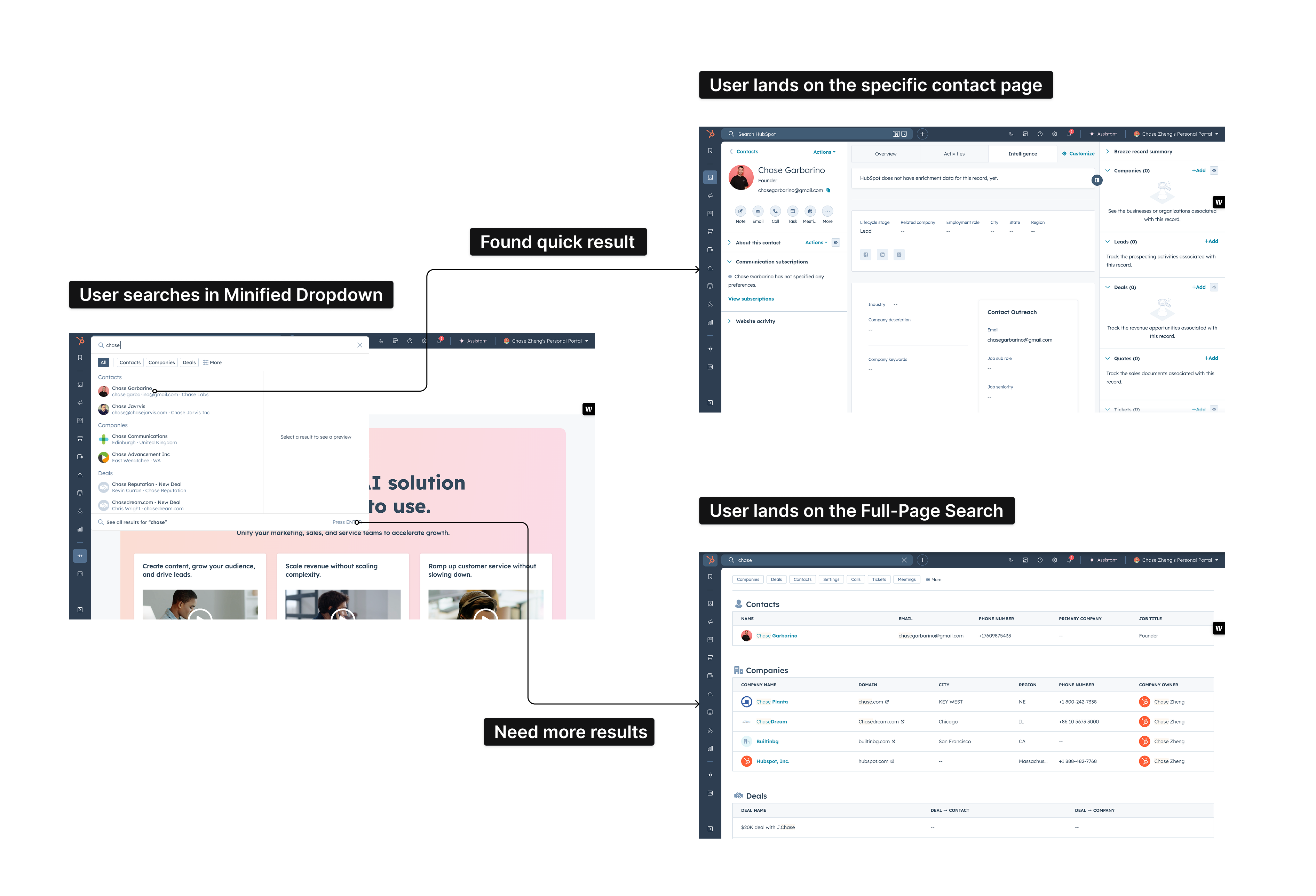
3. Seamless transitions – Whether clicking, tabbing, or hitting Enter, users can move fluidly between results in the dropdown and the full search page without breaking their flow.

Key Design Decisions
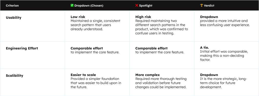
1. Dropdown over Spotlight
We explored two primary architectural patterns: a dropdown and a "spotlight" style modal. While the spotlight pattern felt modern, it presented a higher UX risk. We chose the dropdown solution because it provided a unified, less risky, and more consistent user experience.

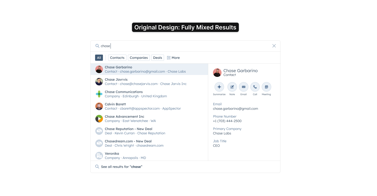
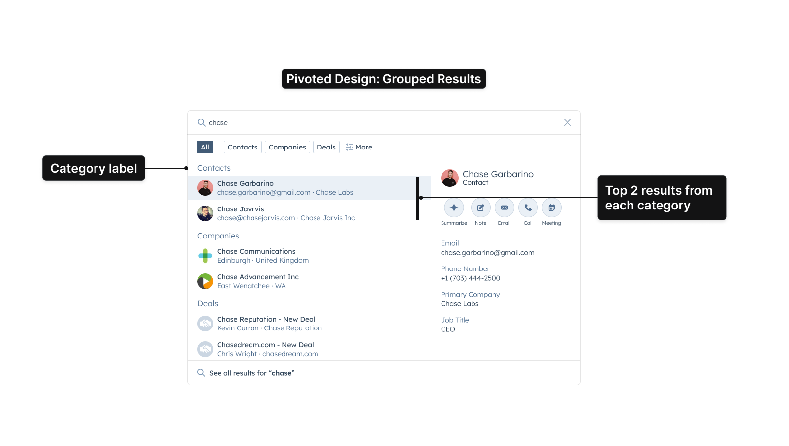
2. A Data-Driven Pivot from Mixed to Grouped Results
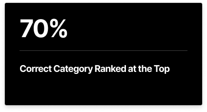
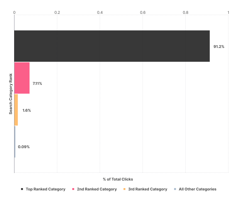
Initial designs explored a fully mixed list of results. However, we pivoted due to a backend constraint. We turned this constraint into an opportunity by using data to inform our new approach.First, we confirmed with analytics that the top 3 ranked search categories accounted for ~98% of all user clicks. This told us we only needed to focus on a few categories to satisfy the vast majority of users.
Insight 1: Top 3 Categories Drive Nearly All Engagement
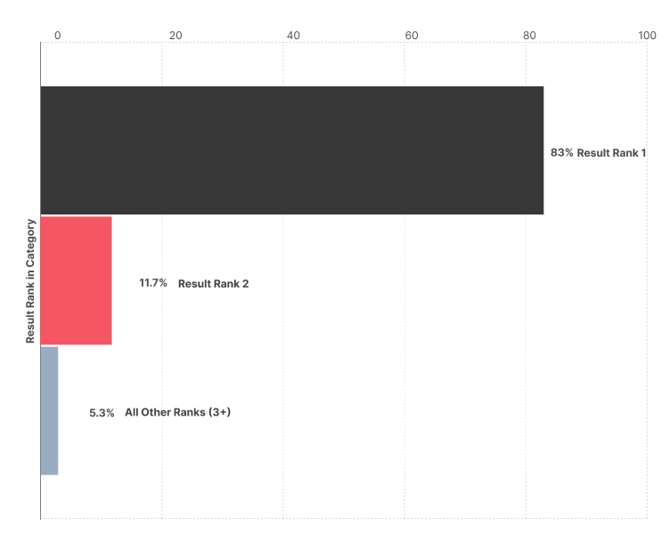
Second, we analyzed the behavior within those categories. We found a clear pattern: the top 2 results in any given category receive over 94% of the clicks for that category. This data gave us the confidence to design a compact view that groups results by category, knowing that surfacing just the top few items would be highly effective.
Insight 2: The Top 2 Results are Critical
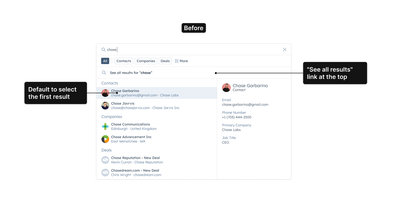
3. Solving a Critical Discoverability Flaw in Testing
Our most significant iteration was driven by a single, critical insight from user testing: users did not know the full-page search existed. To solve this, we implemented a comprehensive, two-part fix.
Part 1: The Visual Fix (Relocating the Link)
First, we addressed the visual discoverability. In testing, we saw that users felt trapped because they never saw the "See all results" link at the top. To solve this, we relocated the link to the bottom of the results list, creating a more natural and visible next step.
Part 2: The Interaction Fix (Redefining 'Enter' Key Behavior)
Second, we addressed a critical keyboard habit. After observing users hit 'Enter' immediately after typing in tests, I validated with Amplitude data that 33% of our users share this behavior. Our original design, which defaulted focus to the first result, would have caused a frustrating error for this group.We redesigned the interaction so that no result is selected by default, and hitting 'Enter' now reliably takes the user to the full search page.
.png)
Evolution & Reflection
The launch of Minified Search was a successful first step, but the project continued to evolve based on user feedback and our long-term product vision.
1. Post-Launch Iterations
Following the initial launch, we continued to refine the experience. A key enhancement involved a visual refresh to align with HubSpot's updated design system, which included refined typography and updated iconography. We also shipped a significant interaction improvement by introducing progressive disclosure for the rich preview panel. The preview is now hidden by default and only appears when a user hovers over a specific result. This reduces initial cognitive load and provides detailed context exactly when the user signals interest.
Visual refresh with progressive disclosure
2. The Future Roadmap
The future vision for search is to create a more unified and intelligent experience, as demonstrated in the single concept below.

This concept elegantly combines two key features:
A. A Unified Search Experience
The left panel introduces a unified search experience, merging the minified and full-page search into a single, responsive, unified panel with "Show more".
B. Proactive AI Highlights
The "Breeze Highlight" section in the right panel demonstrates how we can integrate AI-driven insights and summaries directly into the user's workflow.
3. Personal Reflection: What I'd Do Differently
A key learning from this project was the importance of balancing existing user habits with new interaction patterns. Since then, I've adopted generative AI tools to accelerate this exact process.
To demonstrate, I've used a tool like v0 to retrospectively vibe code a few alternative layouts for the search results. This modern approach allows for the rapid generation of tangible, coded prototypes, which would have significantly accelerated our stakeholder alignment and user feedback cycles early in the project.
A. Compact Card Grid
This concept explores a more visual, card-based grid to improve scannability and allow users to compare results more efficiently than a standard list.

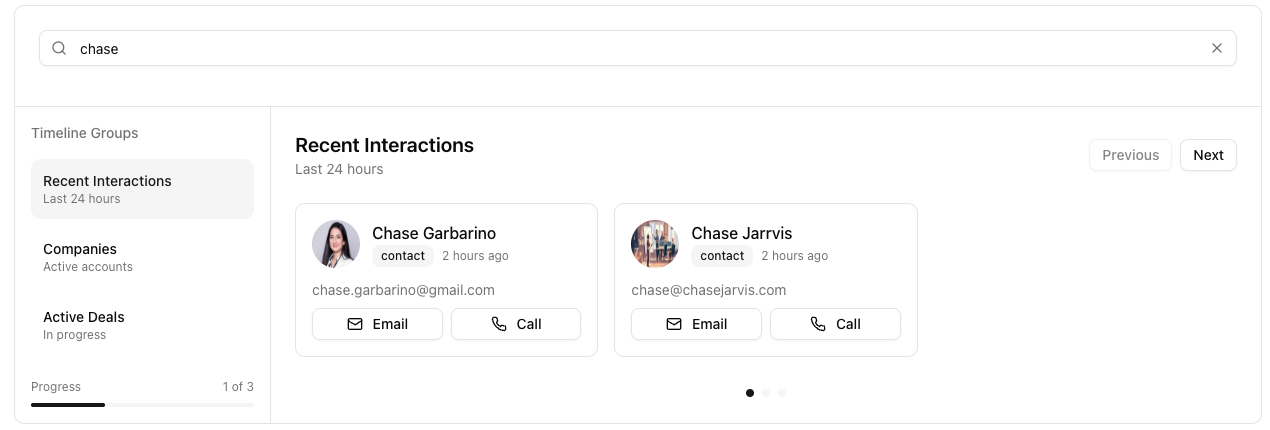
B. Vertical Timeline
This concept introduces a timeline view, organized by recent interactions, to help users prioritize active relationships and add crucial temporal context.